New Design and new Website
After 25 years of ball history, it was time to give the Rainbow Ball a new look. Here we would like to share some insights of the process with you.Just as one Rainbow Ball is over, the preparations for the next one begin. This year, the preparations started especially early, because after the 25th anniversary of our traditional event, it was time for a renewal. Therefore, we started to create a new look in the last months, starting with the logo and basic design up to a brand new website. Of course we want to share a few impressions and results of this process with you.
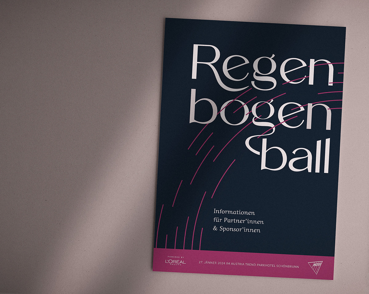
Redesigned logo
With the new look we want to give our inclusive event and our topics even more visibility. Graphic designer Theresa Beck has created the fitting graphic framework for this, and developed a modern logo and design that fits in with a classic ball. The new style is intended to herald a new chapter in our ball history: Through the simple, but also very elegant design, we take the traditional history of the Rainbow Ball with us and at the same time want to open the event to an even wider audience.


New digital look
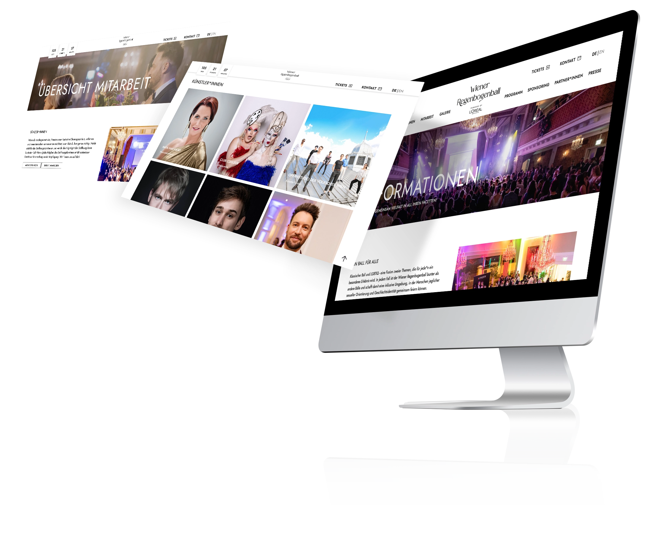
Our web presence has also been reinvented over the last few months by our team in collaboration with the web designers and web developers from bitperfect. By creating a new, modern website, we want to make the inclusive atmosphere and great vibe of the Rainbow Ball experienceable.
But above all, the redesign should also make it easier to participate in the ball: Dancers, volunteers, sponsors and visitors will find comprehensive information about the event and will be guided intuitively through the site.
